כאן סקרנים | למה כל הספרים והעיתונים בישראל כתובים באותו הגופן?
|||||the newspapers||||font
Hier sind neugierig Warum sind alle Bücher und Zeitungen in Israel in derselben Schriftart geschrieben?
Here are curious Why are all the books and newspapers in Israel written in the same font?
אם ניכנס לחנות ספרים ונפתח ספר אקראי,
||||||random
If you go to a bookstore and opened random book,
נראה את הפונט הזה.
||the font|
we'll see that font.
ספר אחר - אותו פונט.
Another book - the same font.
ספר ישן - עדיין אותו פונט.
Old book - still the same font.
אם נפתח את ידיעות, שוב הפונט הזה.
If we open the news, again this font.
ישראל היום, גלובס, הארץ, המודיע,
||||The Reporter
Israel Hayom, globes, Haaretz, Hamodia
הכול באותו פונט.
All the same font.
למה כל הספרים והעיתונים בישראל כתובים באותו הגופן?
|||||||font
Why all the books and newspapers in Israel written in the same font?
במשך מאות שנים כתבו סופרי סת"ם יהודים
|||||Torah scrolls|
For centuries, Jewish scribes wrote
כתבי קודש באמצעות קולמוס.
|||quill
scripture using a pen.
הספרדים כתבו בכתב ספרדי,
the Sephardim||in script|
The Sephardim wrote in a Sephardi script,
שבו לקווים האנכיים והאופקיים של האותיות יש עובי די דומה.
they|the lines|vertical|horizontal||||thickness||
Where the vertical and horizontal lines of the letters have a rather similar thickness.
הכתב האשכנזי, לעומתו, התאפיין בקווים אופקיים עבים
|Ashkenazi|in contrast|was characterized|lines|horizontal|thick
Ashkenaz, however, characterized by thick horizontal lines
ובקווים אנכיים דקים.
|vertical|thin
and thin vertical lines.
במאה ה-15 המציא גוטנברג בגרמניה את מכונת הדפוס.
||invented|Gutenberg|in Germany|||printing press
In the 15th century Gutenberg invented in Germany The printing press.
כ-20 שנה לאחר מכן, התחילו להדפיס באיטליה
|||||to print|
20 years later, start printing in Italy
גם ספרים בעברית.
||in Hebrew
also Hebrew books.
בהתחלה ניסו המדפיסים לחקות את אותיות הסת"ם
|tried|the printers|to imitate|||of the Torah
At first the printers tried to imitate the letters of the STAM
האשכנזיות והמרובעות.
|the square ones
Ashkenazi and square script
אבל מהר מאוד השתלט הסגנון הספרדי המעוגל על הדפוס,
|||took over|style||rounded||the print
But very quickly took over Sephardic style curved pattern,
והוא קיבל השפעה מהאות האשכנזית בעיבוי קל של הקווים האופקיים.
||influence|the letter||thickening|||the lines|horizontal lines
and received effect from the Ashkenazi style easy condensation of horizontal lines.
מאיטליה התפשט הסגנון הספרדי לכל אירופה.
from Italy|spread||Spanish style||Europe
From Italy, the Sephardic style spread throughout Europe.
מאז ועד סוף המאה ה-19, הספרים היחידים שהודפסו בעברית
|||||||that were printed|
From then until the end of the 19th century, books printed in Hebrew
היו רק ספרי קודש,
were only religious books,
והם הודפסו באותם סגנונות כתב ספרדיים ואשכנזיים.
||||script||
They printed those writing styles Sephardic and Ashkenazi.
גם העיתונים היומיים המעטים בעברית וביידיש שהתפרסמו אז,
||the daily|the few|||that were published|
Even the few daily newspapers Hebrew and Yiddish published then,
הודפסו בעיקר באות הספרדית.
Printed mainly with Sephardic style
אבל עם הצמיחה של התנועה הציונית והפיכת העברית לשפה יום יומית,
||the growth||||||||
But with the growth of the Zionist movement And turning the Hebrew language daily,
נוצר צורך בסגנון דפוס או גופן,
created||style|print style||font
Created a need for pattern or font style,
שלא יהיה מזוהה עם כתבי קודש.
that not to be identified with the scriptures.
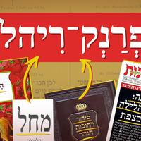
למרווח הזה נכנס ב-1908 רפאל פרנק,
the gap|||||
at this space came in 1908 Rfal Frnk,
החזן הראשי של הקהילה היהודית בלייפציג שבגרמניה.
the cantor|chief||||in Leipzig|in Germany
Chief cantor of the Jewish community Leipzig, Germany.
הוא חבר לבית יציקת אותיות מקומי בשם סי-אף-ריהל,
|member||letter casting|letter casting|local||||Riyal
He joined a local letter-casting company called CF-Rihl,
ועיצב את הגופן פרנק-ריהל.
designed||font|Frank|Riyal
And designed the font Frank-Ruehl.
בהשראת כתבי יד באות ספרדית, בסגנון הארט-נובו.
inspired by|manuscripts|||||the art|Art Nouveau
Inspired manuscripts with Sephardic, Art nouveau style.
סגנון ששאב את השראתו מצמחים, מדברים אורגניים, קישוטיים.
|that drew||its inspiration|plants|talking about|organic|decorative elements
Style inspired by plants, Speaking organic, decorative.
משם נובע הסגנון הצורני שלו.
from there|emanates|style|formal|
From there comes his formal style.
האותיות מאוזנות בקווים האופקיים והאנכיים שלהן,
|balanced|in lines|horizontal|vertical|their
The letters are balanced in their horizontal and vertical lines,
וברורות לקריאה בדפוס.
clear|for reading|in print
And clear to read in print.
לאחר כשנתיים הם סיימו את עבודתם והתחילו להשתמש בו.
|about two years||finished|||||
After two years they finished work And started to use it.
בהיעדר גופן אזרחי אחר, הפך מהר מאוד פרנק-ריהל
in the absence of|font|civil|||quickly||Frank-Riahil|Riehl
In the absence of another civil font, Frank-Rihl became very quickly
לברירת המחדל של כל דבר דפוס בעברית,
the default|default|||||
Default of anything that print in Hebrew
באירופה ובארץ ישראל.
Europe and Israel.
וכך, העיתונים היומיים שנוסדו בארץ בשנים שלאחר מכן,
||daily newspapers|that were founded||||
Thus, the daily newspapers established in the in subsequent years,
כבר השתמשו כולם באותו הגופן.
||||font
already used the same font.
כל כתב עת, עיתון או ספר, נכתבו בפרנק-ריהל.
|||||||in Frank-Riahl|
Every journal, newspaper or book was written in Frank-Rihl.
הניסיון היחיד לרענן את השורות היה של מעריב,
the attempt||refresh||the ranks|||Maariv
The only attempt to refresh the lines Was of Ma'ariv,
שהחליט לעצב מחדש את העיתון ולהחליף לגופן שהתבסס על נרקיס,
|redesign|||||the font|based on||Narcissus
He decided to redesign the newspaper And replace their font based on the Narkis,
של האומן צבי נרקיס.
|the artist||Narcissus
Of artist Tzvi Narkis.
הקוראים התעצבנו והתלוננו, ומהר מאוד מעריב חזר לפרנק-ריהל.
|were upset|complained|||||to Frank|
Readers were upset and complained, And very quickly Ma'ariv back to Frank-Ruehl.
גם כשהעיתונים עברו להדפסה דיגיטלית,
Even when newspapers moved to digital printing,
הם יצרו לעצמם גרסאות מחשב של הגופן והמשיכו להדפיס בו.
|created|||||the font||printing|
They have created their own versions of PC font and continued to print it.
היא השתרשה, והקורא של העברית התרגל למראה צורתה.
|took root|and the reader|||got used to||its shape
It took root, and the reader of the Hebrew Accustomed to the sight of shape.
וקשה מאוד להזיז את ההרגל של הקורא אל משהו חדש,
||move||the habit|||||
And it is very difficult to move the habit of the reader to something new,
כי גם דורות של ילדים מתחנכים על הצורניות של פרנק-ריהל.
|||||are educated||formality|||
because generations of children are educated on the shape of the Frank-Ruehl.
השליטה הבלתי מעורערת של פרנק-ריהל
the control|unquestioned|unquestioned|||
Undisputed control Frank-Ruehl
בכל מילה שנכתבה כאן במשך מאה שנה,
Every word written here for a century,
התערערה אולי רק עם הופעת האינטרנט בשנות ה-90'.
was shaken||||the emergence of|||
Perhaps shaken by the arrival of the Internet in the 90s.
חברת מיקרוסופט שלטה אז ביותר מ-90% מהשוק
|Microsoft|dominated||||
Microsoft controlled more than 90% of the market
עם דפדפן אקספלורר,
|Explorer browser|Explorer browser
With Internet Explorer
והיא קבעה שאת הפורמים ואתרי החדשות שלנו,
|established||the forums||the news|
And she determined that our forums and news sites,
אנחנו נקרא בפונט שלה, אריאל,
|will read|in her font||
We read at her font - Ariel,
גרסה מעובדת לגופן הלטיני המפורסם, הלווטיקה,
|edited|font|the Latin||Helvetica
A processed version of the Latin font, the Velotica
שהיה מתאים יותר לצגי המחשב.
|suitable||to the monitor|
that was more appropriate for computer monitors.
ברוב הגופנים לדפוס שאנחנו מכירים היום,
|the fonts|print||we know|
Most fonts for print We know today,
דוד, נרקיסים וכמובן פרנק-ריהל, יש "סריפים",
David|narcissus|||||shelters
David, Narcissus and of course Frank-Ruehl, There are "Srifim"
בליטות קטנות, שלפי התפיסה המקובלת,
small bumps|||perception|accepted view
Small bumps, According to the accepted view,
עוזרות לנו לקרוא מהר יותר.
help||||
Help us to read faster.
על צגי מחשב, לעומת זאת,
|computer screen||on the other hand|
On computer screens, however,
קל לנו יותר לקרוא גופנים "סן-סריפים", חלקים, כמו הלווטיקה ואריאל.
||||fonts|||sans-serif|||
It is easier to read fonts "San Srifim" smooth, such as Hlootikh Oarial.
לכן פרנק-ריהל נראה מעוות במסמך וורד,
|Frank-Riahl|||distorted|in the document|Word document
So Frank-Ruehl looks distorted in Word document,
אבל חד מאוד בהדפסה.
|||in printing
But very sharp in printing.
מעצבי גופנים, טיפוגרפים,
font designers|fonts|typographers
Font designers, Tifogrfim,
הוציאו בשנים האחרונות עשרות גופנים חלופיים לטקסט,
have released||||fonts|alternative fonts|
Have published dozens of alternative fonts in recent years,
שיתאימו גם לספר או לעיתון,
will fit||||to the newspaper
Suit also book or newspaper,
ובכל זאת, אין עיתון יומי גדול שמעז לנסות.
||||daily||dares|
And yet, there is no big daily newspaper that dares to try.
זה עניין של שיווק ואפילו תת-מודע.
|||marketing||sub|subconscious
It is a matter of marketing and even subconscious.
אם הספר שלנו או העיתון שאנחנו קוראים לא כתוב בפרנק-ריהל,
||||||||||Frank-Riehl
If our book or newspaper we read not write in Frank-Ruehl,
כנראה שלא נתייחס אליו באותה הרצינות.
||we will address|||seriousness
Probably we will not treat him with the same seriousness.