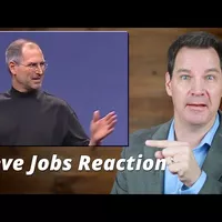
Communication Professor Reacts to Steve Jobs iPhone 1 Speech (2)
We start with a strong foundation. iPhone runs OS X. (audience cheering)
In this last chunk, let's talk about some of the visual elements of how he presents and his visual aids.
Jobs likes to walk around the stage but he's not pacing nervously. He's walking with ease across a massive stage and he's walking with a purpose, in part to connect with a big, big audience throughout the auditorium.
In a situation like this, you have to make it more dynamic by taking up more space.
He's also gesturing really well. He uses textbook gestures really. He has a good home base where he brings his hands together at about belt level and he's making basic gestures once or twice per sentence. And then back to his home base.
He also has what you might call a second home base where he hangs his arms down by his side and looks really comfortable in that position as well. To me, those are the two best places to keep your hands when you're not actively gesturing.
His visual aids are really clear, simple, and use very few words. Many less experienced presenters fill their slides with data, diagrams, lots of text but that's a mistake. By comparison, his slides are really minimalistic. Sometimes his slides only show an image and use no words. This is a less is more approach. That's usually the best approach when it comes to visual aids.
You'll also notice he rarely looks back at his slides. Many presenters will turn away from their listeners and look at their slides most of the time. But he's mostly facing his listeners and I'm guessing he has another screen in front of him with his outline on it as well so he can just glance at it to stay on track.
So let's talk big picture advice and then I'll grade his presentation.
I really have only one minor improvement I would suggest. And it comes down to my personal preference. It's not as noticeable in the short segments we're looking at today, but I began to get tired of his long dramatic pauses that I watched, the more I watched. And it's the same feeling I get when I'm watching a Broadway type show or a musical on a stage. Sometimes it almost feels as if he's pausing to cue the audience or me to applaud. And I don't like it when stage actors pose and wait and make me feel like I'm obligated to applaud. And there are moments in this presentation where I got tired of that dramatic mechanism. I think that's mostly me, my own personal preference. But I also got the feeling that there were some long pauses where the audience was also confused and not sure if they were supposed to clap when he paused. Either way, that's the only minor change that I would suggest. Feel free to disagree with me.
So what grade would I give this presentation? Well, I would give it a D minus. I thought most of this was garbage. Just kidding. Of course, this is obviously an A plus presentation. Everything came together to make this a winner. The timing was right for the iPhone. It was, in the end, a great product. And Jobs knew he had a winner. He had every reason to deliver his message with complete confidence. Looking back, his presentation and the release of iPhone 1 did exactly as he predicted. It represented a revolutionary moment that changed phones forever.
So question for you. What grade would you give Jobs on this presentation? Do you really think he practiced this one or 200 times? Do you think that's just an urban legend? And of course, what else did I miss? And be sure to look in the description section of the video for some free public speaking resources for you.
Until next time, thanks. God bless, and I will see you.

